Lumos Video Store
This page provides a list of educational videos related to Graph Data. You can also use this page to find sample questions, apps, worksheets, lessons , infographics and presentations related to Graph Data.
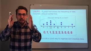
graphs and data line plot -"dot plots"
By Joann's School
Learn how to read and create a Line Plot (Dot Plot)
Modeling- Linear Functions, Quadratic Functions, Exponential Functions PT 1

By Textbook Tactics
Determining if data fits a Linear, Quadratic, or Exponential Model by graphing the data or finding patterns in the data.
[2.MD.10-1.0] Picture and Bar Graphs - Common Core Standard

By Freckle education
Draw a picture graph and bar graph (with single-unit scale) to represent a data set with up to four categories.
Building Scaled Picture Graphs: 3.MD.3

By TenMarks Amazon
Students learn the parts of a picture graph to build scaled picture graphs based on given data.
[3.MD.3-1.0] Visual Representations of Data - Common Core Standard

By Freckle education
Draw a scaled bar graph to represent a data set with several categories
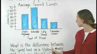
Bar Graphs- Pre Algebra Help
By yourteachermathhelp
Students learn that a bar graph is a visual way to display and compare numerical data (such as the population of different southern states). The bars of a bar graph are drawn in relation to a horizontal axis and a vertical axis and a bar graph can have either vertical or horizontal bars. Students are then asked to create bar graphs using given data and answer questions based on given bar graphs.
How to Make a Frequency Table

By TheMathClips
This short video demonstrates how to organize data into a frequency table, making it easier to interpret or make into a graph.
How to Make a Frequency Table
By TheMathClips
This short video demonstrates how to organize data into a frequency table, making it easier to interpret or make into a graph.
How to Make a Frequency Table
By TheMathClips
This short video demonstrates how to organize data into a frequency table, making it easier to interpret or make into a graph.
When to Use Bar Charts. Episode 1. Which Chart Or Graph Is Right for You?

By Tableau Software
Transforming data into an effective visualization (any kind of chart or graph) is the first step towards making your data work for you. In this video learn best practices for using a bar chart.
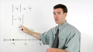
Absolute Value | MathHelp.com
By MathHelp.com
This lesson covers histograms. Students learn that a histogram is a type of bar graph that shows the frequency of data in various intervals (such as the number of residents in a given neighborhood that are age 21-30, age 31-40, and so on). Note that the difference between a histogram and a bar graph is that in a histogram, the data is organized into intervals. Students are then asked to create histograms using given data, and answer questions based on given histograms.
Practice 4 - Analyzing and Interpreting Data
By Bozeman Science
Science and Engineering Practice 3: Analyzing and Interpreting Data Paul Andersen explains how scientists analyze and interpret data. Data can be organized in a table and displayed using a graph. Students should learn how to present and evaluate data. Intro Music Atribution Title: I4dsong_loop_main.wav Artist: CosmicD Link to sound: http://www.freesound.org/people/CosmicD/sounds/72556/ Creative Commons Atribution License
Finding One Variable Statistics With a Graphing Calculator

By YouTube (Firm)
This quick YouTube video from high school statistics teacher Roger W. Davis explains how to find one variable statistics using the TI-84 graphing calculator. The demonstration goes through three steps: entering the data, finding one variable statistics using the STAT menu, and interpreting the results. The data created includes mean, sum, median and more. Flash player is required to view this video, and the running time for the clip is 3:12.
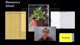
Language Focus: Data Commentary
By
In this video, we'll look at describing data in tables and figures. This process is how a journalist can tell people what the numbers and figures in an article mean. We call this data commentary. We'll look at three things: where to find the data, what it means, and moderating a claim.
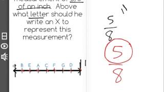
[4.MD.4-1.0] Fractional Line Plots - Common Core Standard
By Freckle education
Make a line plot to display a data set of measurements in fractions of a unit (1/2, 1/4, 1/8)
Line plots and stem-and-leaf plots
By MathPlanetVideos
Construct a stem-and-leaf plot out of the following data: 6, 6,7,8,9,13,16,19,21,25,26
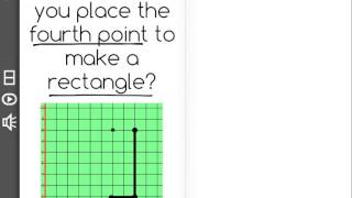
[5.G.2-1.0] Points in Coordinate Plane - Common Core Standard - Word Problem

By Freckle by Renaissance
Represent real world and mathematical problems by graphing points in the first quadrant of the coordinate plane. Front Row is a free, adaptive, Common Core aligned math program for teachers and students in kindergarten through eighth grade. Front Row allows students to practice math at their own pace - learning advanced concepts when they're ready and receiving remediation when they struggle. Front Row provides teachers with access to a detailed data dashboard and weekly email reports that show which standards are causing students difficulty, what small groups can be formed for interventions, and how their students are progressing in math.
[5.G.2-1.0] Points in Coordinate Plane - Common Core Standard
By Freckle by Renaissance
Represent real world and mathematical problems by graphing points in the first quadrant of the coordinate plane. Front Row is a free, adaptive, Common Core aligned math program for teachers and students in kindergarten through eighth grade. Front Row allows students to practice math at their own pace - learning advanced concepts when they're ready and receiving remediation when they struggle. Front Row provides teachers with access to a detailed data dashboard and weekly email reports that show which standards are causing students difficulty, what small groups can be formed for interventions, and how their students are progressing in math.
Understanding Measurement Data Displayed in Line Plots: 2.MD.9
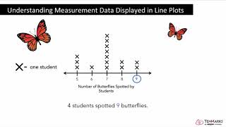
By Tenmarks Amazon
Students learn how to interpret measurement data displayed in line plots.