Lumos Video Store
This page provides a list of educational videos related to Bar Graphs. You can also use this page to find sample questions, apps, worksheets, lessons , infographics and presentations related to Bar Graphs.
Bar Graphs- Pre Algebra Help
By yourteachermathhelp
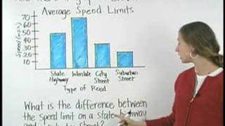
Students learn that a bar graph is a visual way to display and compare numerical data (such as the population of different southern states). The bars of a bar graph are drawn in relation to a horizontal axis and a vertical axis and a bar graph can have either vertical or horizontal bars. Students are then asked to create bar graphs using given data and answer questions based on given bar graphs.
[2.MD.10-1.0] Picture and Bar Graphs - Common Core Standard

By Freckle education
Draw a picture graph and bar graph (with single-unit scale) to represent a data set with up to four categories.
Graphs for 2nd grade - pictograph and bar graph
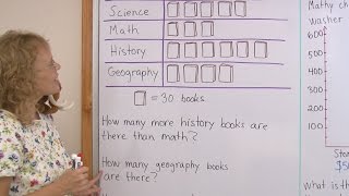
By mathmamoth
a pictograph (or a pictogram) and a bar graph. The pictograph has to do with books in a library, and one symbol of a 'book' means 30 books.
More solving problems with bar graphs | Fractions | 3rd grade

By Khan Academy
Interpret bar graphs to answer questions about a context.
Bar graph vs Histogram

By Alice Keeler
The difference between a histogram and a bar graph and what to consider
When to Use Bar Charts. Episode 1. Which Chart Or Graph Is Right for You?

By Tableau Software
Transforming data into an effective visualization (any kind of chart or graph) is the first step towards making your data work for you. In this video learn best practices for using a bar chart.
[3.MD.3-1.0] Visual Representations of Data - Common Core Standard

By Freckle education
Draw a scaled bar graph to represent a data set with several categories
Solving problems with bar graphs 3
By Khan Academy
Let's start with this bar chart that brings back the days of Harry Potter! Putting our toes in the water on this one...
Absolute Value | MathHelp.com

By MathHelp.com
This lesson covers histograms. Students learn that a histogram is a type of bar graph that shows the frequency of data in various intervals (such as the number of residents in a given neighborhood that are age 21-30, age 31-40, and so on). Note that the difference between a histogram and a bar graph is that in a histogram, the data is organized into intervals. Students are then asked to create histograms using given data, and answer questions based on given histograms.
graphs and data line plot -"dot plots"
By Joann's School
Learn how to read and create a Line Plot (Dot Plot)
Building Scaled Picture Graphs: 3.MD.3

By TenMarks Amazon
Students learn the parts of a picture graph to build scaled picture graphs based on given data.
Box and Whisker Plots : Skewness and Outliers. : ExamSolutions
By ExamSolutions
Youtube Presents Box and Whisker Plots : Skewness and Outliers. : ExamSolutions an educational video resources on statistics.
Plot and Subplots: Creative Fiction Writing

By Cy Porter
Find and map out the plot and all the subplots in your story. Work on them separately to improve your story. It's better to look at each subplot separated from the rest of the story. Use subplot to make three dimensional characters.
[4.MD.4-1.0] Fractional Line Plots - Common Core Standard
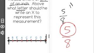
By Freckle education
Make a line plot to display a data set of measurements in fractions of a unit (1/2, 1/4, 1/8)

Ex: Matching Correlation Coefficients to Scatter Plots

By Mathispower4u
Ex: Matching Correlation Coefficients to Scatter Plots