Grade 8 Math - Interpreting Data Tables and Scatter Plots

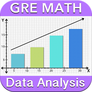
Construct and interpret scatter plots for bivariate measurement data to investigate patterns of association between two quantities. Describe patterns such as clustering, outliers, positive or negative association, linear association, and nonlinear association.

The apps, sample questions, videos and worksheets listed below will help you learn Interpreting Data Tables and Scatter Plots.

Interpreting Data Tables and Scatter Plots Lesson Plan Resources - Worksheets

Interpreting Data Tables and Scatter Plots Lesson Plan Resources - Educational Apps

TOPICS RELATED TO INTERPRETING DATA TABLES AND SCATTER PLOTS

What does a scatter plot tell you?

Scatter plots are similar to line graphs in that they use horizontal and vertical axes to plot information factors. but, they have a totally specific cause. scatter plots display how a great deal one variable is laid low with some other. the relationship between two variables is called their correlation .

What are the 3 types of scatter plots?

With scatter plots we often speak about how the variables relate to every other. this is called correlation. there are 3 varieties of correlation: tremendous, negative, and none (no correlation). tremendous correlation: as one variable will increase so does the alternative.

How do you interpret data from a scatter plot?

You interpret a scatterplot by using seeking out trends inside the information as you go from left to right: if the statistics show an uphill pattern as you move from left to right, this indicates a high quality dating between x and y. because the x-values boom (circulate proper), the y-values have a tendency to growth (pass up).