Lumos Video Store
This page provides a list of educational videos related to Use Data. You can also use this page to find sample questions, apps, worksheets, lessons , infographics and presentations related to Use Data.
Understanding Data Distributions Using a Normal Distribution Curve

By PatrickJMT
The Normal Distribution and the 68-95-99.7 Rule. In this video, I talk about the normal distribution and what percentage of observed values fall within either 1, 2, or 3 standard deviations from the mean. One specific example is discussed. For more free math video, visit http://PatrickJMT.com
Ways to Represent Data
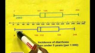
By EducationCommonsRW
This is the second lesson in the series, "Data Handling." The video demonstrates how to compare data using box and whisker plots and how to decide the most appropriate way to represent data graphically.
[3.MD.4-1.0] Visual Representations of Data - Common Core Standard

By Freckle education
Generate measurement data by measuring lengths using rulers marked with halves and fourths of an inch.
Reading bar charts: comparing two sets of data
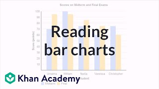
By Khan Academy
A bar chart is especially useful with comparing two sets of data. The difference in the bars give us a quick snapshot that allows us to draw some conclusions.
Continuous or Discrete? - YouTube

By Mathceratops
Here's how to tell when a data type is continous or discrete, and what kinds of situations you'd use each data type in. This is more fun than a barrel of monkeys -- which, by the way, would be an example of discrete data.
Mean and Expected Value of Discrete Random Variables
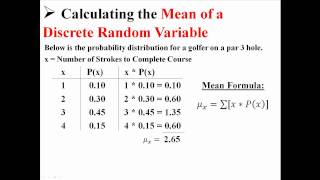
By statslectures
This video summarizes for us in less than two minutes how to find the expected value for a discrete random variable. In order to apply this to empirical data, form a histogram from your data and use that to determine relative frequencies.
Practice 4 - Analyzing and Interpreting Data
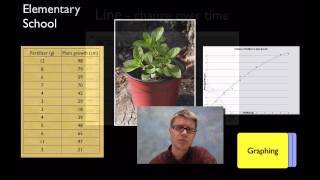
By Bozeman Science
Science and Engineering Practice 3: Analyzing and Interpreting Data Paul Andersen explains how scientists analyze and interpret data. Data can be organized in a table and displayed using a graph. Students should learn how to present and evaluate data. Intro Music Atribution Title: I4dsong_loop_main.wav Artist: CosmicD Link to sound: http://www.freesound.org/people/CosmicD/sounds/72556/ Creative Commons Atribution License
Creating bar charts

By Khan Academy
We're going to create a bar chart together using using data from a survey.
Understanding Data Distributions Using a Normal Distribution Curve
By PatrickJMT
The Normal Distribution and the 68-95-99.7 Rule. In this video, I talk about the normal distribution and what percentage of observed values fall within either 1, 2, or 3 standard deviations from the mean. One specific example is discussed. For more free math video, visit http://PatrickJMT.com
When to Use Bar Charts. Episode 1. Which Chart Or Graph Is Right for You?

By Tableau Software
Transforming data into an effective visualization (any kind of chart or graph) is the first step towards making your data work for you. In this video learn best practices for using a bar chart.
Interpreting Line plots
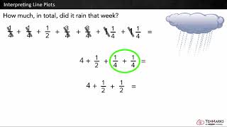
By Tenmarks Amazon
Students learn to interpret line plots by using the given data to answer questions involving fractions and whole numbers.
Introduction to Frequency Tables

By Bryan Corcoran
A brief introduction to the use of Frequency Tables. Definitions of statistics, data, and frequency table are discussed.
Examples of Creating Dot Plots

By Adam Gonzalez
This video shows us two examples of organizing data using a dot plot. Use these videos to get a better sense for how to create dot plots on your own!
Examples of Creating Dot Plots
By Adam Gonzalez
This video shows us two examples of organizing data using a dot plot. Use these videos to get a better sense for how to create dot plots on your own!
Representing relationships with matrices

By Khan Academy
Sal shows how matrices can be used to efficiently represent data about the prices of toilet paper and toothpaste in two different cities.
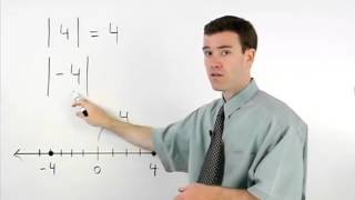
Absolute Value | MathHelp.com
By MathHelp.com
This lesson covers histograms. Students learn that a histogram is a type of bar graph that shows the frequency of data in various intervals (such as the number of residents in a given neighborhood that are age 21-30, age 31-40, and so on). Note that the difference between a histogram and a bar graph is that in a histogram, the data is organized into intervals. Students are then asked to create histograms using given data, and answer questions based on given histograms.
Finding One Variable Statistics With a Graphing Calculator

By YouTube (Firm)
This quick YouTube video from high school statistics teacher Roger W. Davis explains how to find one variable statistics using the TI-84 graphing calculator. The demonstration goes through three steps: entering the data, finding one variable statistics using the STAT menu, and interpreting the results. The data created includes mean, sum, median and more. Flash player is required to view this video, and the running time for the clip is 3:12.
Solving problems with line plots 1
By Khan Academy
Create a line plot from a set of data. ������������Use the line plot to answer questions.
Inferring population mean from sample mean | Probability and Statistics | Khan Academy

By Khan Academy
Much of statistics is based upon using data from a random sample that is representative of the population at large. From that sample mean, we can infer things about the greater population mean. We'll explain.
Conditional Probability Example : ExamSolutions

By ExamSolutions
Watch this video to see some examples of conditional probability problems. This video uses a tree diagram to organize data, but this may not always be possible or reasonable. Still, it is good to have this option at the ready.